
Response to Tutor feedback on Assignment One of Context & Narrative
The Assignment itself can be read here and below I give some extracts from the feedback.
Your thorough research has underpinned your project providing a sound base to experiment with. This has enabled you to take some risks with this project, experimenting with the poster and printing on newsprint has really added extra depth and strong narrative.
Technically and visually you have submitted a set of very competent images, well balanced and well composed. This helps to illustrate your idea of the ‘forensic’ approach’ but as a criticism this approach is the same for both sets of images which is not helping with ‘Two sides of the story’.
‘Living on the Edge’ also shows and hints at vulnerability with sinister overtones, isolated properties with flimsy fences (I love the textures and colour palate), the strong wooden fence by the road has menacing overtones. The vegetation encroaching onto the properties perhaps becoming them,. These are some clues the viewer may pick up from these images.
I was pleased to read this. My preference would have been for the whole series to be about ‘living on the edge’ and in retrospect I could have dealt with this by doing one set in monochrome or evening light.
‘There are dangers in the Wood’ the similar light has not helped differentiate the two sets, a moody darker more sombre light would have induced much more sense of foreboding. You comment about twilight and how that affected you, so where is the twilight? I do really like the idea and the poster is great, especially the close up so we can read it and then the pulled back shot which gives us a strong sense of place so I feel overall that this is a successful assignment especially as you are aware of the similarity between the two sets of images.
Being a bit more ‘picky’ should the clothing have been slightly grubbier and the shoe on its side? Again these are clues that could enhance the narrative. You could argue that the clean clothing and upright shoe actually becomes more ambiguous and surreal, so discuss on your blog!
I didn’t think of having the shoe on its side but did think about the clothing. My reasoning was that clean clothing could more signify that something had only recently happened. The upright shoe was because there was similar colouring between that and the brown earth and path and I thought that the red parts of the shoe might stand out more.
Your large cat is a valiant attempt at photocomposition and certainly ticks the box for risk taking. (in consideration of the light) …the Lynx image should share a sympathetic light with the woodland with shadows and dappled light you would expect the feet to have more of a solid shadow ‘holding’ the Lynx to the floor. Do we need to see the Lynx so close and in its entirety? If it had been emerging in the background from behind a bush just slightly visible it would be a much more intriguing image offering the viewer more to consider.
Suggestions for photographers to look at in respect of working with light
Several interesting photographers suggested. I won’t comment on them all here but I was particularly interested by Sharpe’s Wood (2007) Liza Dracup, where very long time exposures were used to photograph the wood by the light of faraway street lights and the headlights of passing cars. This work was commissioned by the Impressions Gallery and made in woodland over several years. Striking images, with an almost unearthly light rather than a frightening aspect.
Also, John Blakemore used long time exposures in woodland in his early work to “giving a sense of living through blur and movement to woodland”. I have long admired Blakemore’s work and experimented with photographs of dying tulips a couple of years ago , see here I have ordered the recommended book A Retrospective 1955-2010 and already have Blakemore’s Black and White Photography Workshop (2008).
Further action
I took some 5×7 prints with me to the work review section at the Johanna Ward Talk (see here). Johanna was very interested in the house that looked like a gingerbread cottage saying it reminded her of a Disney film Watcher in the Woods. She encouraged me to do work with that, including introducing myself to the owner and seeing if I could photograph inside. My courage failed me on that score but I did take some further photographs in the woods.
Re-working
I aimed for darker days that would help towards longer exposures, using a tripod. I made a selection and then processed these along the lines of an HDR effect gained by reducing highlights and increasing shadows and contrast. I also experimented with the shoe on its side and did another lynx composite using a different background.
Here are some colour versions.


Further work on the Lynx composite
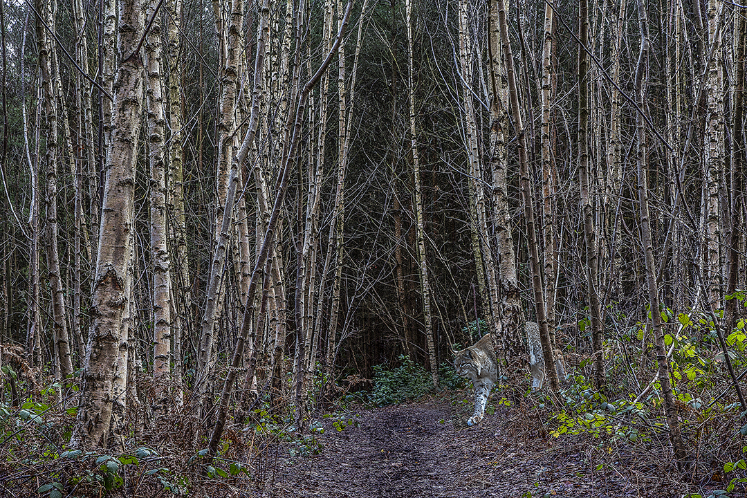
I layered the lynx to look as if it was emerging from the trees and essayed a shadow using the ‘burn’ tool. It’s quite an art re-sizing to look proportionate and still more practice needed.
I also experimented with different papers, including Permajet Titanium lustre to see what effect that would give. I took these to the recent OCA Thames Valley Group meeting, see here . Feedback there was that the different papers were distracting. We had quite a discussion about the staged shots with the shirt and shoes, also the poster I created and whether I could do something more along those lines in terms of actually leaving posters there regarding something lost/found to see what happened. Sharon, our attending tutor, also suggested to stay slightly ‘wacky’, as with the lynx image and to do more of those as opposed to the more sinister ones with abandoned clothing.
In retrospect I do feel reluctant to try anything that would ‘trick’ people too much, especially as just recently, on two separate days, I did really lose a dog collar and had telephone calls soon after to let me know each had been found. In fact one person even came to our house whilst we were out and left a collar on the door handle.
In the spirit of experimentation and also in response to my tutor’s mild rebuke concerning my failure to do the earlier street photography exercise properly (comparing colour with black and white) I have also converted the images and used Nik Silver Efex for this.


I do find it difficult to compare because, to me, they just look like black and white versions of a colour image. Is there more a sense of menace?
Given direct feedback during the OCA Thames Valley Group meeting and also further comments on this blog post I made the decision to print the four images above in colour and these will be submitted for formal Assessment.
Pointers for the next assignment
- You demonstrate good technical abilities so allow yourself to consider the image more, the technical will just work for you!
- Consider coherence with your images.
- Do read carefully what the exercises and assignments are asking for and make sure you include all the information
- Carry on allowing your research to inform your own practice
Now I’m moving on to Part Two. My previous tutor has now retired from OCA work. Many thanks to him for his support and advice which helped to keep me going.
12th February 2015
References
Blakemore, J (2008), Black and White Photography Workshop, David & Charles Ltd, Cincinnati, OH

I keep wondering what the wood photographs would be like if you had made them really dark. The one with the lynx in particular where there is no sky. The sky is an optimistic note in these woodland scenes I think…It is like it is a way out. Maybe also in the colour image desaturate the colours a bit to remove the sparkle…. Some great images here. Is this the wood where we made your portrait?
LikeLike
I’m looking at them only laptop now and they look lighter than they did on my computer where they seemed to dark. It’s so much easier when they’re printed! I did think of desaturating a little – will try that as it ws a result of the quasi HDR effect I think. This is a different wood – smaller than the Common but nearer to where I live now.
LikeLike
Really interesting post one more time Catherine, and great feedback! I like the ones you re-worked. My preference goes immediately to the colour set, I find them more threatening and darker because more “graspable”, more real. I can imagine myself alone in the forest and a bit scared. There is a smoothness in the BW which reassures me too much, it is too ‘fine art’ (that’s also a compliment!), but it is not as immersive, there is less a sense of the menace for me.
There is a graphic novel that you should absolutely read, it is called “beautiful darkness” http://www.amazon.co.uk/Beautiful-Darkness-Fabien-Vehlmann/dp/1770461299/ref=asap_bc?ie=UTF8 and I am sure you will find something in it…
LikeLike
I’m still trying to work out my relationship with b+w. I really appreciate other’s work with this but can’t see anything in my own. This is odd because I was brought up in a b+w photography world which seemed natural to me. Maybe that’s it, it seems too ‘normal’ somehow like the grey, uniform council estate where I was born and brought up. Probably why I like bright colours now.
The books looks interesting so I’ve ordered it – thanks for that.
LikeLike
Well done Catherine. I have always loved B&W but recently have been processing more of my own images in colour and like Stephanie I prefer the colour set . I find it hard to say why I prefer them but I feel they have a believable quality that is missing from the mono version.
LikeLike
Hi Judy and thanks for the feedback. You’re very skilled with b+w. Do you think you’re processing in colour more because of the Documentary Course?
LikeLike
Interesting to come to this post late, and with so many adroit comments to consider as well. As usual I have enjoyed your summary, very considered. I find it interesting your term about conversion – to black and white – as if it were an afterthought, and similarly the effects you have added on that conversion using the plug-in. I think that the monochrome images might have worked better for you IF you had considered them as black and white images from the outset I.e. There was a purpose about their lack of colour. Monochrome work has a very different contrast range than colour and without considering the consequences of that difference the rhetoric of the image will tend to deliver a completely different reading.
Love the trees though
LikeLike
I know you’re right. I just can’t seem to think black and white in that way.What do you mean by a different contrast range for example, i.e. I knew the birch trees in the lynx composite would add contrast and also the tree roots, whereas amongst the trees everything is pretty much mid-tone. What else should I be looking for?
LikeLike
Well! Blakemore is a good place to start (I say that as I know you have a copy of his workshop (so do I)), it’s about distinguishing between colour contrast and contrast delivered by light. I know that sounds very simplistic. There is generally a lot of discussion about monochrome delivering excellent texture, but colour can do that equally. What you should be looking for? It is about contrast illuminated by light and recognising how colour sometimes seduces the trigger finger! I suppose what I’ve learned in the past couple of years is that there needs to be a purpose for monochrome, it is the medium of fiction; veracity is better served by colour.
LikeLike
That fits – I did use monochrome for some of the work in DPP – John Donne’s poem and also my poem about the beast. It fitted the emotional sense there. Colour is concerned with light as well though isn’t it due to how it lies on the spectrum.
LikeLike
Really encouraging feedback Catherine; you worked hard on this project and I’m glad that this has been recognised. I’m a great fan of black and white but I agree with others here in that this case I prefer your colour images as they seem more real and therefore more menacing than the mono ones. I’m with John in that I find my best black and white images (I say ‘best’ – I am no expert!) are ones that I can see (and I mean ‘see’, not ‘visualise’ – it’s more than that) in black and white before I take them – for instance in the street photography exercise in C&N I looked for and shot totally different subjects for the black and white set than I did in colour.
LikeLike
I seem to remember that you looked for lines and shapes. I’ve been doing quite a bit of re-reading recently reminding myself to it all.
LikeLike